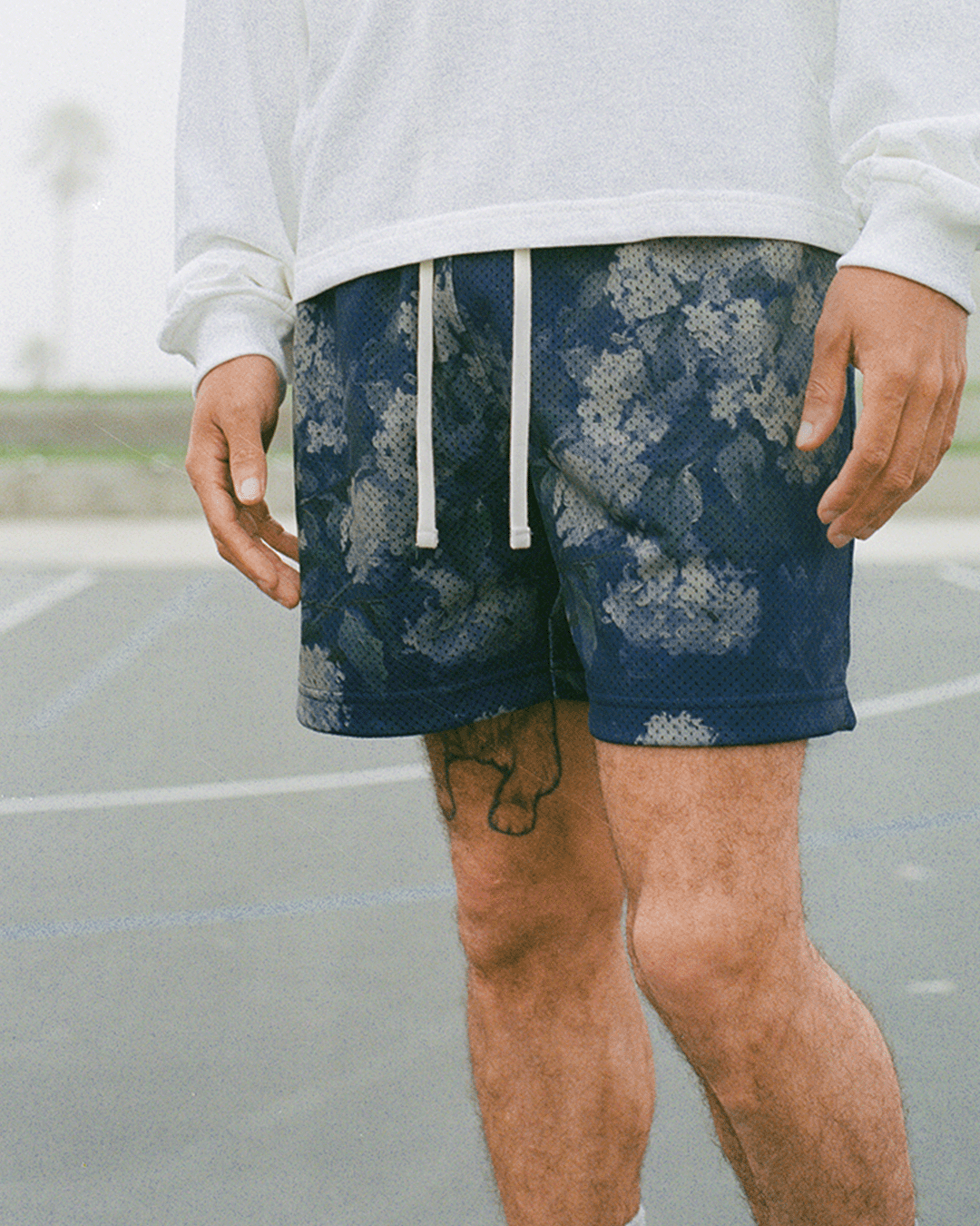
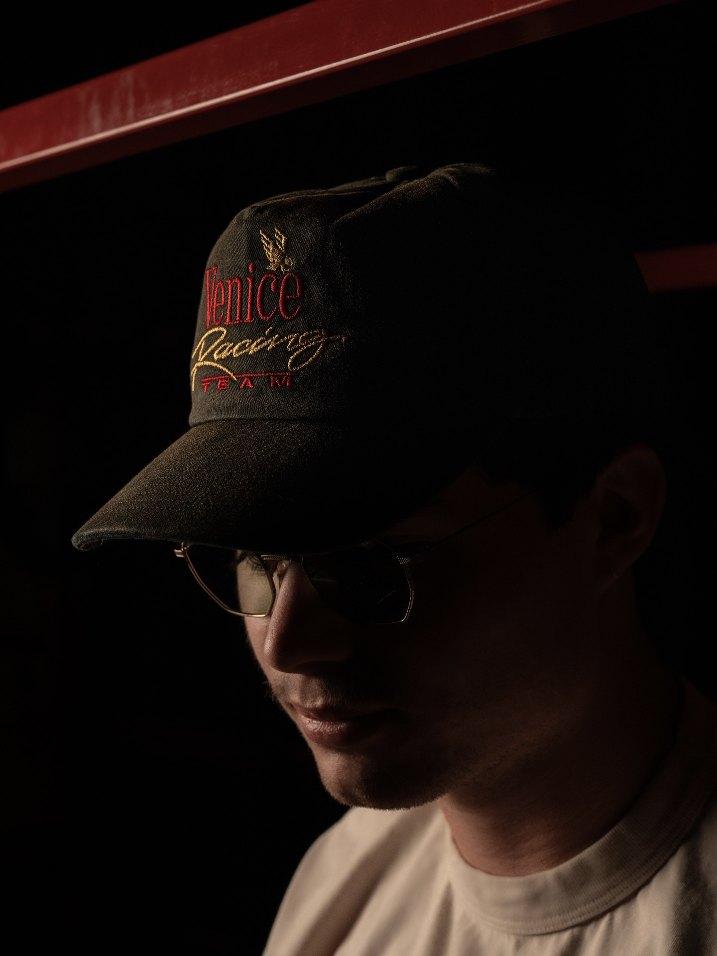
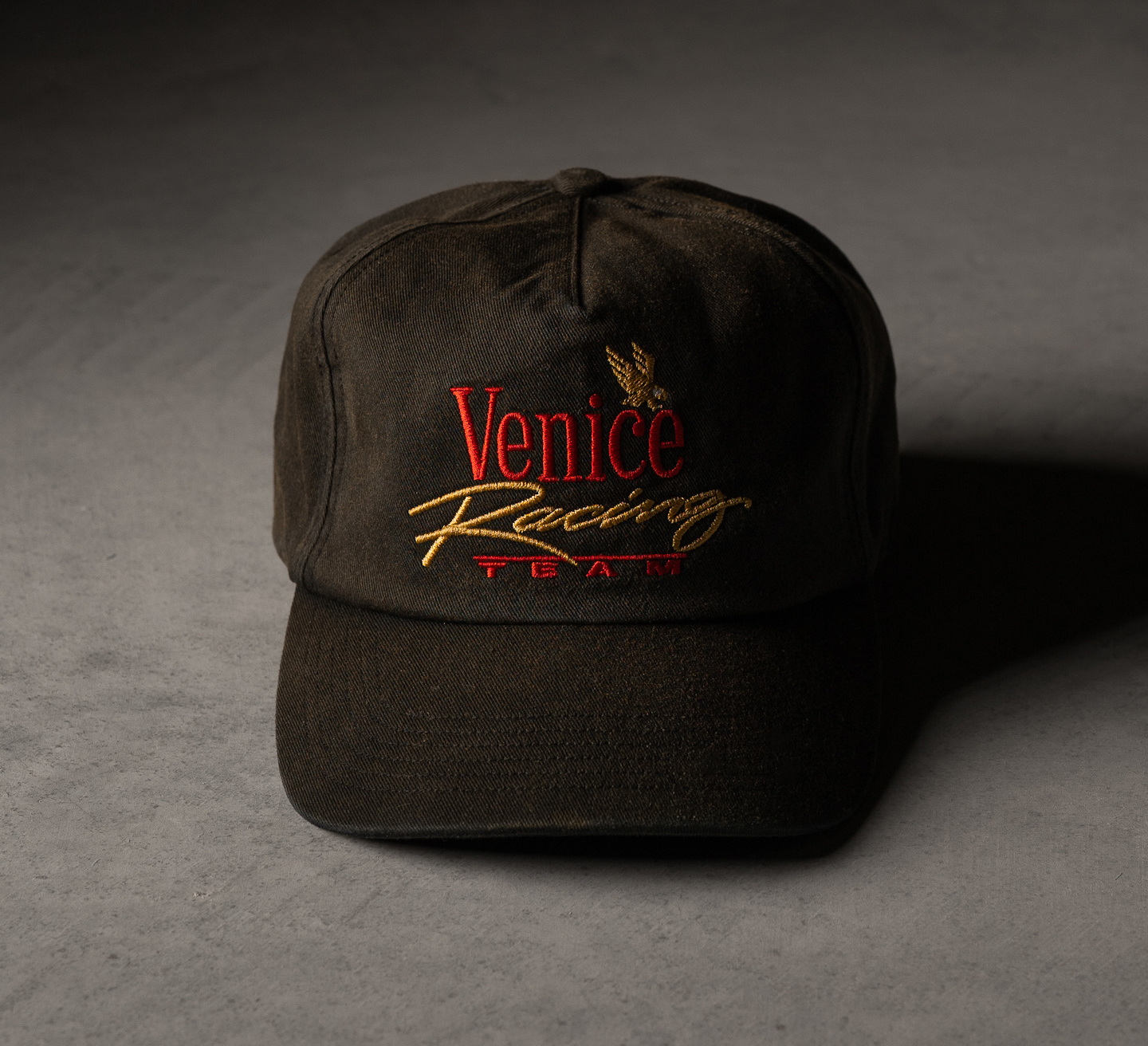
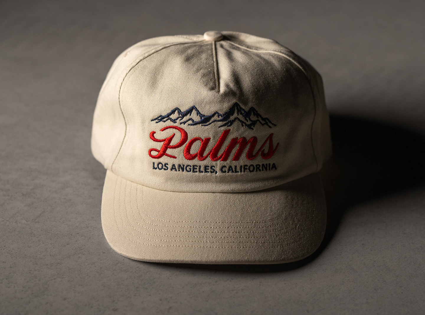
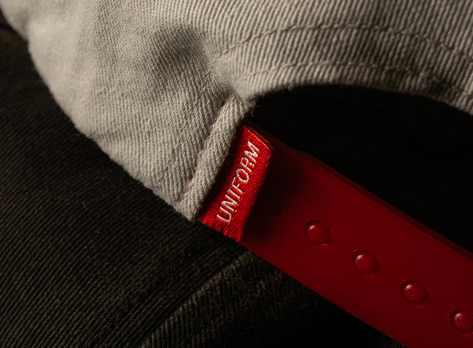
Elevated basics to elevated graphic program.
UNI/FORM built its reputation on restraint: honest materials, meticulous construction, no ornamentation to hide behind. The brand's entire identity rests on what it refuses to do. Introducing a graphic program meant asking a specific question: how does a brand built on absence add pattern and iconography without undermining the discipline that made it credible in the first place.
UNI/FORM's positioning is precise by design. Basics done right, nothing decorative, no trend-chasing. That precision is the product. It's also a constraint. Most brands add graphics by loosening their standards, treating pattern and logo work as a separate, looser category from the core line. For UNI/FORM, that approach would have contradicted the brand at the exact moment it was expanding. The graphics needed to feel like the same design discipline, applied to a new vocabulary, not a departure from it. OBJECT—STUDIO treated the graphic program as an extension of UNI/FORM's existing rigor rather than a brand pivot. Every pattern and mark needed a specific origin, not a generic "cool" reference pulled from nowhere.
The graphic program didn't cause UNI/FORM to become a different brand. It uses the same discipline that built the perfect basic to hold up under a new set of decisions: pattern, color, reference, restraint. The sell-through on these pieces suggests that a brand built on precision can say more without saying it carelessly.